- 221.157 – Week #1.1 Notes
28th February, 2022
Introductions
Getting set up in the Zoom class.
Introduction to Helen, Ginell (and Tom, on Thursdays)
Went over the basics of thee project, how to borrow a camera, etc.
Lots of the students in self-isolation, so hard to get out and shoot. Must suck – sympathies!
How to access Massey Block 6 for Mac use, etc.
Project Brief
Utilising digital photographic capture, editing, and processing software you will be challenged to evaluate, interpret and re/present your position in the world around you. You will develop an understanding of communicating using photographic images through the practice of critical evaluation of your own, and others, images.
You will identify a site in Wellington to photograph. You should consider how you engage with this site in relation to your background, where you have come from, and how you might announce yourself today through this site.
Helpful strategies might be:
- Choose a site
- Why are you drawn to this site and how might it relate to your background and your identity?
- How might you announce/introduce yourself ‘today’ through your chosen site?
- Consider a photographic strategy/genre; or explore a range of photographic genres that best describe your site in relation to your background and identity.
Following a process of researching and photographing your site, by week six you will produce a series of 3-5 digital images and one 16×12 inch inkjet print, accompanied by a 150-word statement which addresses why you chose that location, and how the visual material you have collected or created with your camera has engaged with the concepts of mihimihi. You will consider the relationship between the digital and printed images, and the possibilities offered by the different outputs.
You will be assessed based on the paper’s learning outcomes. We will assess your final and developmental work, your involvement in the class workshops, exercises, and discussions. These are to be evident in a physical workbook.
My initial thoughts
So, I’m naturally enough going to choose somewhere I can walk to, because I might end up in self-isolation.
Got to be something based on Days Bay. The beach? History?
What do I have in my recent photos that could fit into this, given that I’ve shot a lot in Days Bay in the past couple of months?
Plan: draw on what I have, then add shoots once I get started down a track.
To Do
- Chase the Mac order along.
- Buy an Adobe Creative Cloud subscription.
- Look for existing images.
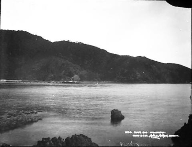
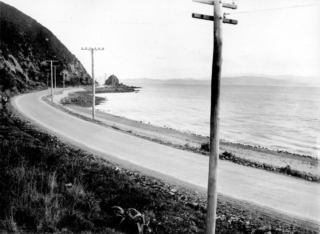
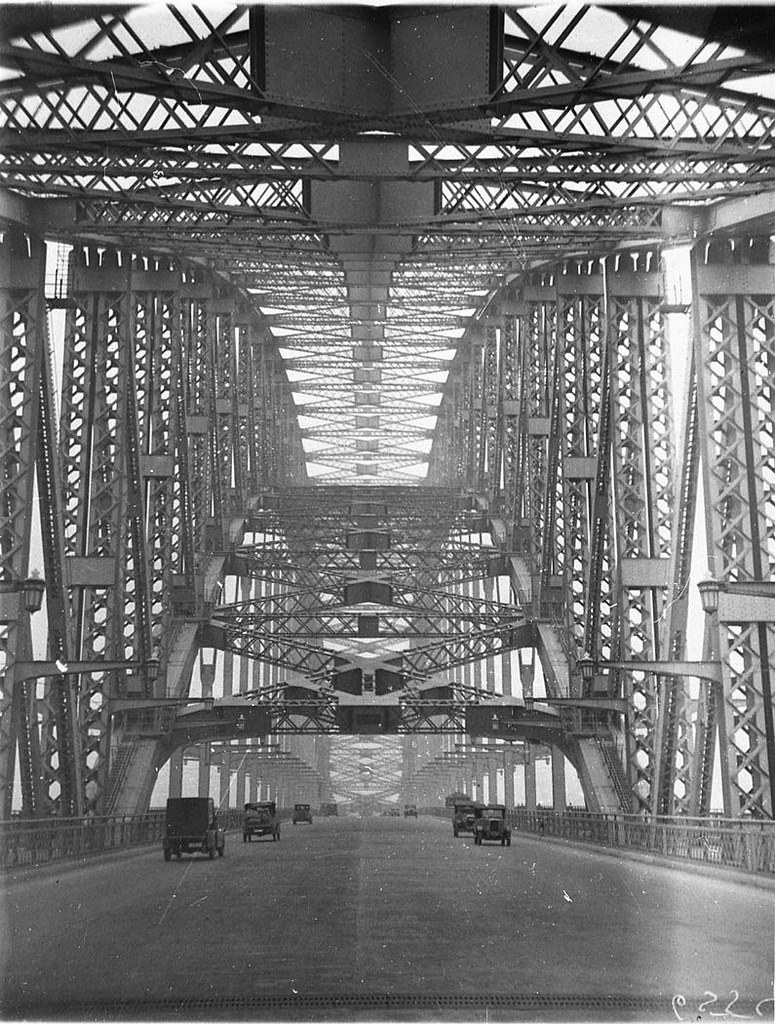
Days Bay, Wellington, New Zealand, by Muir & Moodie. Te Papa (C.014751) - 221.157 – Week #1.2 Notes
3rd March, 2022
Photography Basics
Basic, analogue stuff
Not going to make a lot of notes on this – been doing this for a long time.
Guidance around use of tripod if slow shutter speed. Not sure I agree with a handheld if shutter speed over 1/60s, particularly for long lenses.
My own preference for hand holding: 1 / focal length is a good rule of thumb, e.g. 100mm lens, can hand-hold up to 1/100s. Need to factor in the 1.6x of APS-C, so a 100mm lens on an APS-C camera can be handheld at shutter speeds faster than 1/160s.
Also, depends on the shutter. The uber slick shutter in my X100T doesn’t move the camera, and the release is very smooth, so I can get away with hand-held shots at 1/10s if I’m careful.
Digital stuff
This is the main reason why I’m here…
Digital Noise
Film grain is more like a texture that brings to life the images. Noise is a defect of the sensitivity of the camera to the light. Noise is the result of the interpretation of the light in an image that the camera can’t capture. In digital photographs, “noise” is the commonly-used term to describe visual distortion.
The size of the grains in the film varies depending on the film sensitivity. The more sensitive the film, the larger the grains. Digital noise is always the size of a pixel, regardless of the ISO setting.
Film grain is color neutral, as it consist mostly of luminance differences. Digital noise consists of both luminance and color differences, and is most visible in the blue color channel.
In the more recent digital cameras the digital noise is quite even. In earlier models the noise had more banding and patterns. The film grain doesn’t have any banding or patterns, so it’s seen as pure noise. If the digital noise has any banding or pattern, the brain can easily pick that up, and that is more disturbing than pure noise.
Neither grain nor noise eats detail. It’s noise reduction that eats detail, as it can’t tell the difference between small details and noise. Noise reduction is used on digital noise, but it can also be used to reduce film grain.
Project Concept
Look at Days Bay out of season.
Shoot the bay and the surroundings during quiet times.
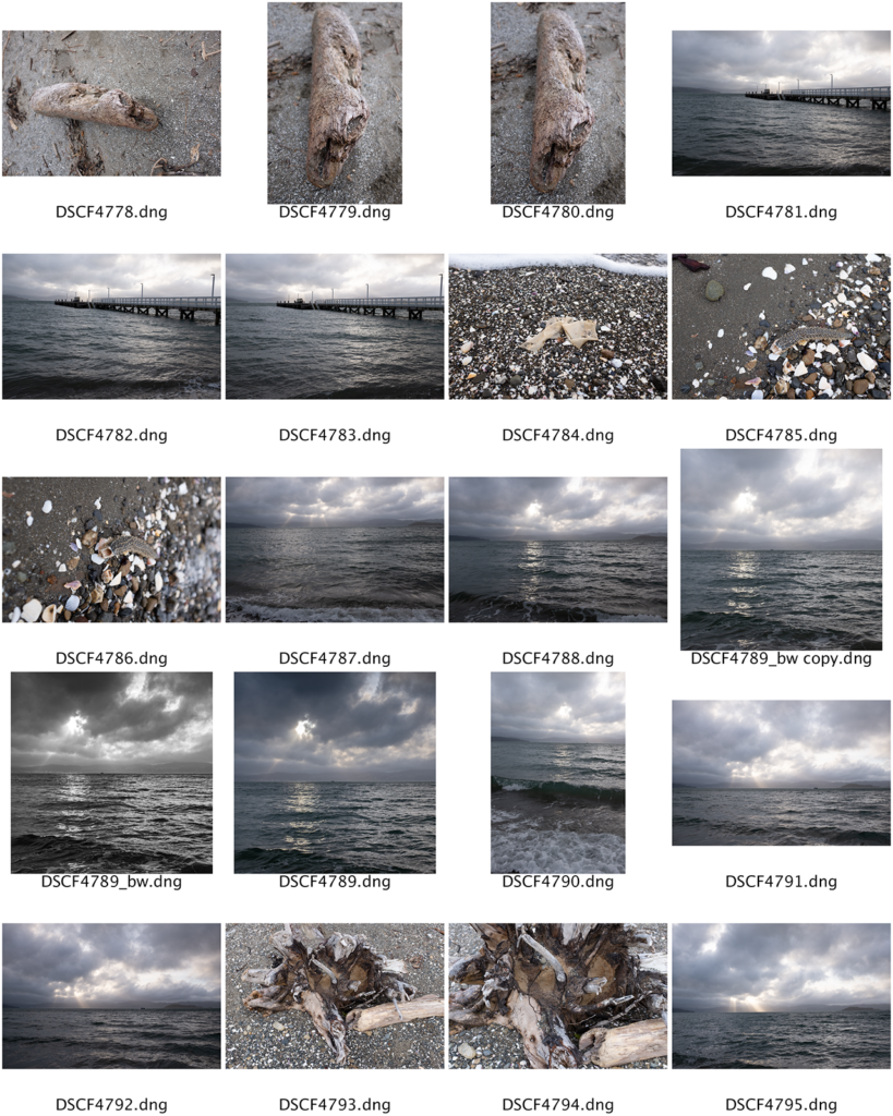
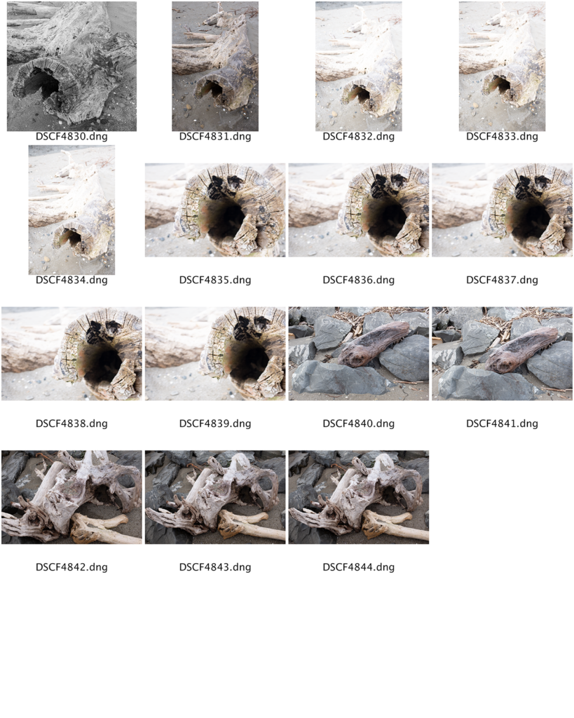
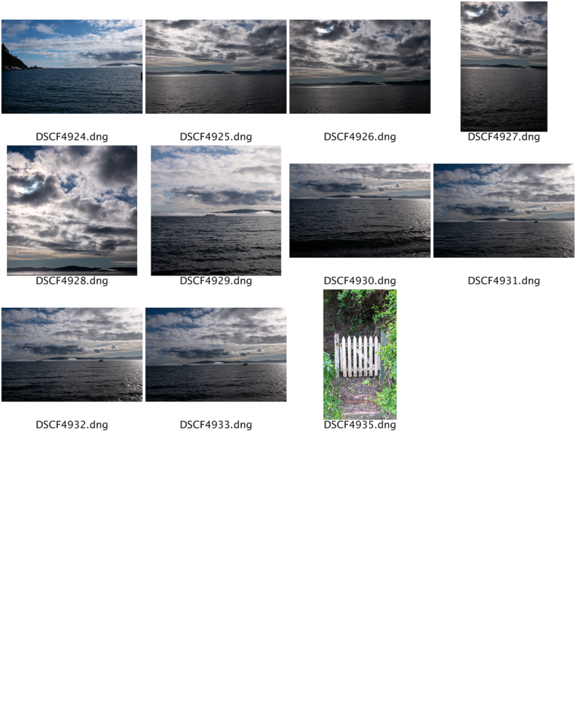
Images from recent shoots
Turns out that I do have some existing recent images that would work for this concept.
Note for review: all of the edits to images on these contact sheets were made as part of Lens.
- 221.157 – Week #2.1 Notes
7th March, 2022
Digital Workflow
Importing
- Adobe Lightroom OK for individuals (we use Bridge as better on shared network).
- Use Adobe Bridge
- Import the RAW files from the camera.
- Import as a DNG, which is a digital negative.
Corrections
Remove lens aberrations first.
Remove chromatic aberrations.
Then get into editing the levels/channels.
The “Basic” tools
Develop your own workflow.
Assess the histogram.
e.g. work through the histogram and sliders in order?
Workflow (from Handout)
I borrowed this from the class notes:
Camera
- Shoot in RAW files
- Use manual settings to control exposure correctly
- Downloading images
- Download through Bridge
- Convert RAW files to DNG as you download (check box)
Bridge
- Use Bridge to organise and manage your files
- Make contact sheets of the WHOLE shoot, print and put into your workbook with notes about:
- What you tried
- What worked and what didn’t
- What you plan to try next
- Go through every shoot and mark the photos you are happier with – come up with your own system but perhaps mark photos you really like 5 stars and ones you think you like with 3 stars. This way when you come back you can easily sort them and only look at the photos you’re happier with.
- Adjust the images you are happier with in Adobe Camera Raw (ACR)
- At this stage global adjustments to get the white balance, crop/straightening and tonal adjustments right are enough
- Once you have a smaller selection you might use the Contact Sheet function in ‘Output’ to print larger versions of some of the photos you’re happier with (perhaps 4 per page) and put these into your workbook with notes discussing them.
- Repeat the above multiple times, assessing and refining your work as you go, developing your project and how you are communicating with your photographs.
To Do
- Get to know Adobe CC, initially Bridge and Camera Raw.
- Start to develop a workflow for myself that suits how I shoot. Historically, I tend to crop for form/shape before any retouching, but is this OK?
- I’ve not worked with contact sheets before. How does this work? I’m assuming that there’s an automated tool for this.
Wellington City Council Archives, 00117-1-50 - 221.157 – Week #2.2 Notes
10th March, 2022
Show and tell
Ben
Ben showed his work.
Spends lots of time on the South coast of Wellington.
Shoots at night.
Very long duration photography.
Talk of reciprocity failure for film emulsions – hey, I remember that!
Helen
Shoots landscapes, mainly on the Central Plateau
Enjoys shooting before/after storms.
Balance between tramping/climbing and photography.
I was reminded of this: “Anything more than 500 yards from the car just isn’t photogenic.” – Edward Weston
Group Work
Got set up with 4 other people.
As always: friendly, clever, young people!
I shared a Google doco with my team.
We need to look at 2 photos each.
Probably connect with Instagram or something?
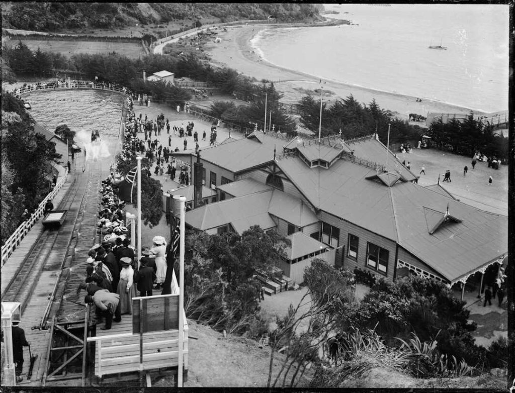
Looking down onto the Pavilion and water chute at Williams Park, Days Bay, Lower Hutt, Wellington, with the beachfront at the top right of the image. Photograph taken ca 1910s by Sydney Charles Smith. 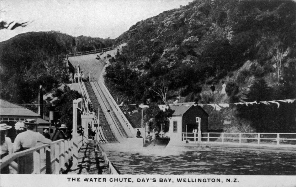
Water chute at Williams Park, Day’s Bay, circa 1900. Photographer unidentified. - 221.157 – Week #3.1 Notes
14th March, 2022
Tasks
Two tasks to complete:
- Choose two photos, examine, write-up.
- Language of photography (based on David Bate’s writing)
Then, wrap these into a presentation ready for class on Thursday.
Two Photos
This is a follow-up to last week’s activities. I chose the following:
- Andreas Gursky | Selected Works – Rhine II.
- Franco Fontana | Landscape (1978).
Rhine II
Andreas Gursky | Selected Works – Rhine II. https://www.andreasgursky.com/en/works/1999/rhein-2. Accessed 13 Mar. 2022. Fontana, Landscape (1978)
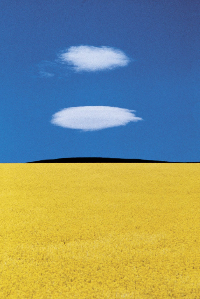
Puglia 1978 | Franco Fontana | On Landscape. https://www.onlandscape.co.uk/2022/03/puglia-1978-franco-fontana/. Accessed 14 Mar. 2022. Gursky
Visual
- Natural light, overcast day.
- Entire landscape is in focus.
- Relatively fast shutter speed – river frozen in time, no motion blur.
- Printed version on satin finish paper (Andreas Gursky, MOMA).
- Very limited monochromatic colour palette – essentially green and grey.
Design
- Highly abstract
- Framing feels irrelevant, like the river could go on forever.
- Horizon is dominant – draws one’s eye.
- Very linear – bands of colour.
Method/Equipment
- Gursky shoots on 5 x 7 and 4×5 inch large-format cameras, before scanning his negatives to work on them digitally. Gursky uses 100 ASA Fuji film in two large-format Linhof cameras that are positioned side by side, one with a slight wide-angle lens, the other with a standard one. Exposure time: 1/8 of a second, f-stop 5.6 to 8. He needs this for depth of field, and the relatively low-speed film for the resolution. While any occasional blurred movement is discarded later in the process. He gains speed by underexposing the film stock one f-stop, and has it developed using push processing.
‘Andreas Gursky Is a German Photographer Known for His Linhof Camera.’ Anatomy Films Analog Photography, 18 Sept. 2018, https://www.anatomyfilms.com/andreas-gursky-big-art-big-money/. - His process involved shooting chromogenic prints (or “c-prints”) with film, using a large-format 5 × 7-inch (12.7 × 17.8-cm) camera; he scanned the images and digitally retouched and manipulated them on a computer. In Rhein II (1999)—which is 5 × 10 feet (about 1.5 × 3 metres)—Gursky created a nonexistent section of the Rhine River.
Andreas Gursky | German Photographer | Britannica. https://www.britannica.com/biography/Andreas-Gursky. Accessed 13 Mar. 2022.
Meaning
- Desire for abstraction, and commentary on landscape free from human presence.
- By joining photographs of different segments of the river, Gursky invented an entirely new landscape, free of industry and human presence.
Andreas Gursky | German Photographer | Britannica. https://www.britannica.com/biography/Andreas-Gursky. Accessed 13 Mar. 2022.
Fontana
Visual
- Natural light, bright sunshine.
- Entire landscape is in focus.
- Possible slow shutter speed, although no movement in field (maybe no wind)..
- No access to print, so unsure of texture.
- Limited colour palette – blue/yellow/white/black.
Design
- Highly abstract
- Essentially frameless – composition continues on
- Dominant horizon – the “island”
- Very linear, bands of colour (cv Gursky)
Method/Equipment
- No info on equipment – often seen with a Leica rangefinder, but recently also with high end Canon digital equipment.
Meaning
- Broke away from black and white as “fine art”; embraced colour.
- Paring down landscapes to essentials.
- Makes colour and texture primary elements.
Comparing the two images
- Both break pretty much all of the unwritten rules of landscape photography/painting:
- No “rule of thirds”.
- No leading lines.
- Little foreground interest.
- No vanishing point.
- No use of negative space.
- No framing elements.
- Strong horizon at the centre of the image.
- Strong use of horizontal lines.
- Very limited palette.
- Little variation in light
- Contrast comes through colour/shape..
- No shadows.
My personal views
I very much dislike “traditional” landscape photography/painting. These two photographs are landscapes, but pared down to the absolute minimum. I like geometric and abstract photographic work, and enjoy how these images use landscape as the base for this.
Clearly I’m not the only one who values this approach: Rhine II sold for $4.3m.Language of Photography
We split our group of six into two subgroups of three, then choose three of the following elements.
- Perspective
- Blur and movement
- Portraits, mood, and lighting
- Points of view
- Rhetoric – All groups must choose the Rhetoric task because it brings together the themes discussed in the essay.
Next step is to take photos to reflect these elements. Finally, present two or three photos per element to the whole class.
My group chose Portraits, Points of View, and Rhetoric.
References
https://www.tate.org.uk/art/artworks/gursky-the-rhine-ii-p78372
https://www.collecteurs.com/artists/franco-fontana/artworks/landscape281
https://www.onlandscape.co.uk/2022/03/puglia-1978-franco-fontana/
- 221.157 – Week #3.2 Notes
17th March, 2022
Presentation Day
Presented on our David Bate assignment.
Watched everyone else presentations and gave feedback.
Other
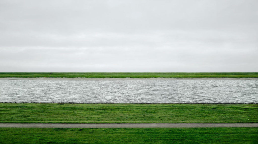
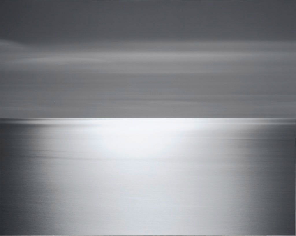
After the tutorial time wound up, I got interested in seascapes and looked at the work of other photographers.
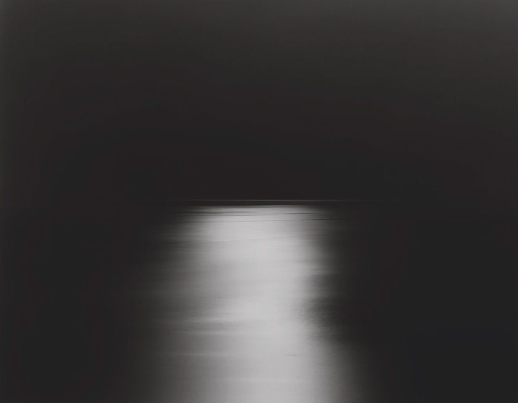
Hiroshi Sugimoto
- 221.157 – Week #4.1 Notes
21st March, 2022
Critique Day
Took a look at everyone’s work.
Interesting to see what other people are up to.
Notes for my work
Perhaps stick to B&W or colour for coherence; best to avoid a mixture, unless it’s for effect, I guess?
Maybe go back to Camera Raw and try reworking into B&W or colour? Stick with the same crop.
Get the theme sorted out.
Build on the ideas from Sugimoto-san’s work? Get more water into them?
Stick with the lack of people.
Try some night shots?
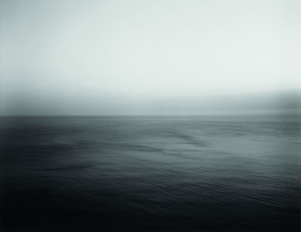
Inspiration
Don’t know who took these, but pretty cool.

- 221.157 – Week #4.2 Notes
24th March, 2022
More inspiration
- 221.157 – Week #5.1 Notes
28th March, 2022
Group Feedback
Zoom School sucks.
Not a lot of structure.
Not a lot of conversation.
Each of these sessions costs about $75. It would be good to think that I’m getting $75 of value from them. Perhaps I’m treating University differently to most people, because it’s not just a badge collecting exercise so that I can then take the degree and parlay it into job. University needs to stretch me so that I grow as an artist, in this case as a photographer.
Anyway, enough of the self-pitying whines.
Where am I up to?
What I got from today’s session
Need to develop the theme of my images more, and build a connection.
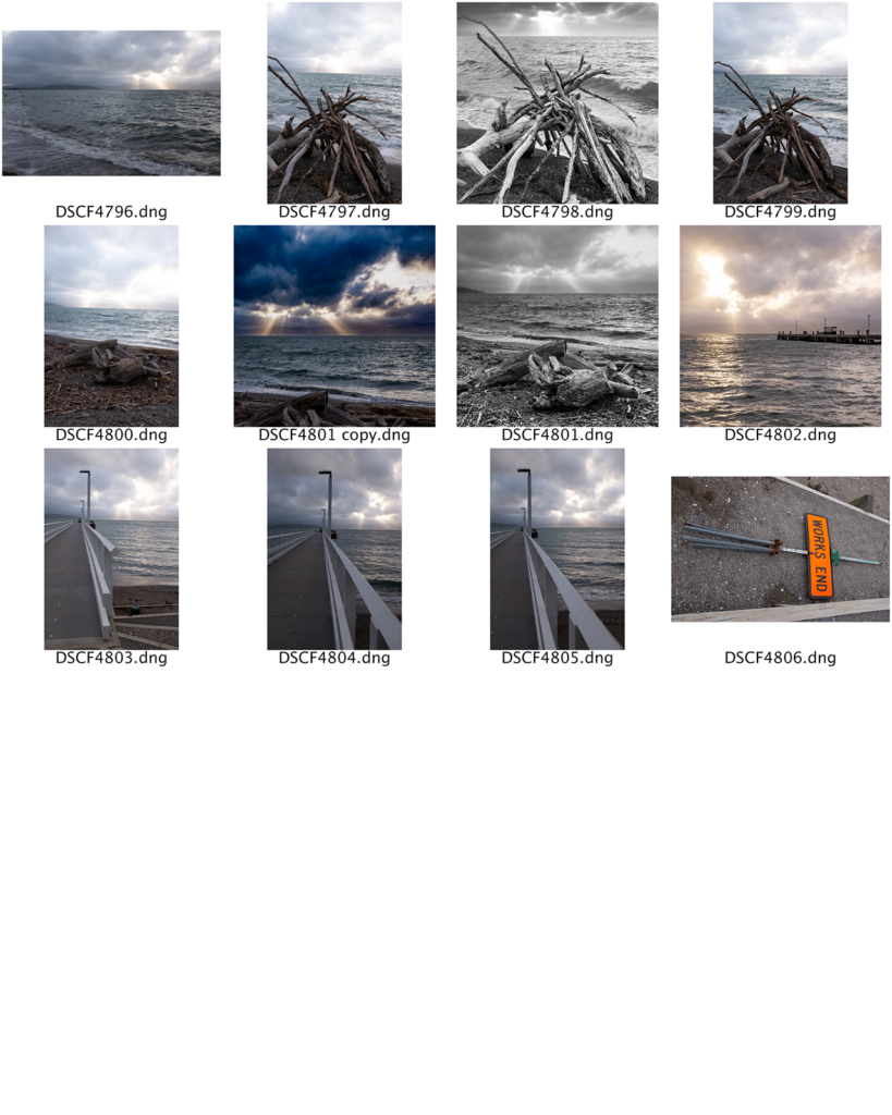
Contact sheet so far
- 221.157 – Week #5.2 Notes
31st March, 2022
Influences
This was actually a really good class – waaaay better than Monday.
Each member of the class showed a couple of their favourite photographers.
Looking forward to seeing the list of them all, so I can track down their work.
Such a great variety to get one’s teeth into!
- 221.157 – Week #6.1 Notes
4th April, 2022
Reminder, our images are to be…
…accompanied by a 150-word statement which addresses why you chose that location, and how the visual material you have collected or created with your camera has engaged with the concepts of mihimihi.
We went through what we’d produced.
So far, mine is a bit woolly and subjective. Wrong word. Melodramatic? Over-emotional?
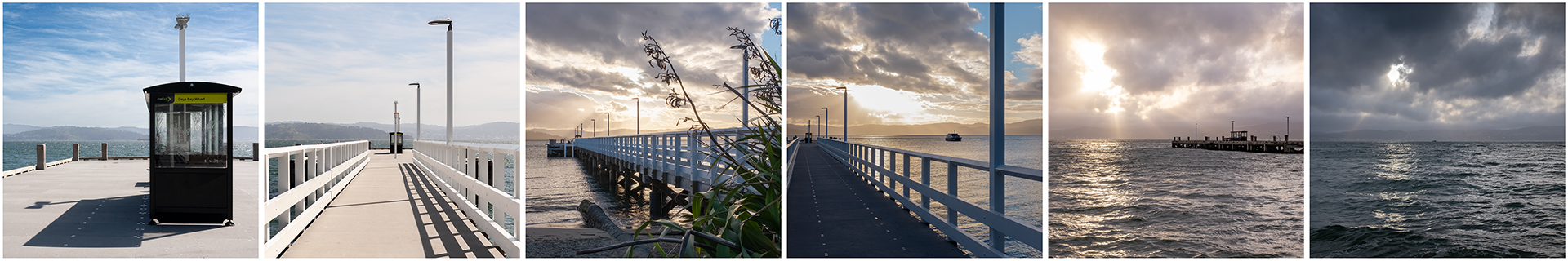
Days Bay is known for being Wellington’s day out on the beach. For most of the year, however, it’s a sleepy commuter village.
In the height of Summer, I don’t find Days Bay to be a welcoming place. It feels crowded and full of strangers, and coming back home to it can be stressful. I find myself hurrying home. Conversely, in the quiet times I feel welcomes the moment I step off the ferry and onto the wharf. There is a palpable sense of relaxation, and I sense that in the other passengers too. I stop to enjoy my surroundings; I listen to the sea and the gulls.
With my images, I wanted to show the beauty of the bay outside the summer season. The beach, the bay, and the sea are an ever-changing inspiration to me. Subtle shifts in the weather can affect the sea and sky dramatically. Storms can bring things onto the beach – from jellyfish and seaweed to huge logs. The seasons and the time of day create subtle shifts in light.
So, Ginell helped me tune it a bit. That was helpful – need to better connect to the actual images.
Then, listened into what other people were trying, including writing one of these 150 word things from scratch, which went… OK, although would have been maybe three times too long. Editing seems to be far more important that writing with these things.
- 221.157 – Week #6.2 Notes
6th April, 2022
Final Presentation Day!
The journal of my life as a BFA student